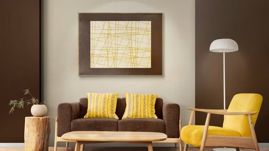

"Visual noise" in home interiors occurs when clashing colors and patterns overstimulate the brain, causing stress. By applying the 60-30-10 color theory rule, maintaining consistent undertones, and selecting hues based on room function, you can balance your palette, create visual harmony, and transform your home into a calming sanctuary.
Is your home feeling cluttered, even when it’s tidy? You might be experiencing "visual noise," a phenomenon where an overwhelming mix of colours, patterns, and shapes keeps your nervous system in a state of low-level stress.
Visual noise occurs when too many competing elements vie for your attention, preventing your brain from finding a focal point. By applying the principles of colour theory, you can shift your home from a source of distraction to a sanctuary of calm.
The 60-30-10 Rule: Your Blueprint for Balance
The most effective way to eliminate visual chaos is to manage the "weight" of your colours. Interior designers frequently use the 60-30-10 rule to ensure a space feels curated rather than chaotic.
60% Dominant Colour: This should be your base, usually covering walls, flooring, or large furniture. Choose a neutral or muted tone to create a calming "canvas" that anchors the room.
30% Secondary Colour: Use this for larger items like sofas, curtains, or an accent wall. This colour should complement the dominant shade, adding depth without causing visual friction.
10% Accent Colour: This is your "pop" of personality. Reserve this for smaller items—cushions, art, or decorative lamps—to draw the eye to specific focal points without overwhelming the overall composition.
Matching Colours to Room Function
Your choice of colour temperature—warm or cool—directly impacts how your nervous system responds to a space.
For Calm and Restoration: In bedrooms or bathrooms, prioritize cool hues like soft blues, sage greens, or lavender. These colours "recede" visually, creating a sense of openness and signaling the brain to wind down.
For Focus and Productivity: Home offices benefit from deep navy or forest green. These shades promote concentration, whereas highly saturated warm colours like bright red can increase stress and reduce performance on detailed tasks.
For Social Energy: Living and dining areas thrive on warm tones like terracotta, warm white, or soft olive. These colours "advance" visually, making a room feel intimate, inviting, and conducive to conversation.
Harmonizing Your Palette
If your home feels "noisy," it may be because your colours are competing for attention. Use these professional strategies to create flow:
Stick to Analogous Schemes: Pick colours that sit side-by-side on the colour wheel (e.g., blue, blue-green, and green). This creates a natural, cohesive transition that is easy for the eye to process.
Check Your Undertones: A common cause of "visual noise" is mixing warm and cool undertones. Hold a piece of white paper against your floors or large furniture; if the colour looks yellow/pink, it is warm; if it looks blue/gray, it is cool. Keeping undertones consistent across open-plan spaces prevents jarring visual breaks.
Why It Matters
When your interior environment is visually harmonious, you reduce "decision fatigue," allowing your mind to rest. By strategically using colour theory, you aren't just decorating; you are creating a supportive atmosphere that actively reduces stress and enhances your daily well-being.
Key Facts at a Glance
Visual Noise: An overabundance of competing visual stimuli that interferes with a room’s focal point.
60-30-10 Rule: A simple formula for balance; 60% dominant, 30% secondary, and 10% accent colour.
Cool vs. Warm: Cool colours recede (calming), while warm colours advance (energizing/inviting).
Undertone Consistency: Matching undertones across rooms ensures a seamless visual flow.
Frequently Asked Questions
Q: Can I use bold colours without creating visual noise?
A: Yes. Use bold colours as your 10% accent. By limiting high-intensity hues to small decor items, you create visual interest without causing overstimulation.
Q: How do I identify the undertone of my current furniture?
A: Hold a plain white piece of paper next to the item. The contrast will immediately reveal if the item leans toward yellow/red (warm) or blue/gray (cool).
Q: Does lighting affect these colour choices?
A: Absolutely. Always test paint swatches on your walls at different times of the day (morning, afternoon, and evening) before committing to a full colour scheme.
Source: Hindustan Times, CMY Cubes, Sense Canvas, Design+Encyclopedia, Beautiful Homes, Unity Interiors, Swavelle Group, FabCuro, Garret Cord Werner Architects